.png?width=200&height=80&name=Classic%20Experience%20(1).png)
The heat map widget is a powerful tool that allows you to pull two attributes from a template, plot them on the X and Y axis, and then give you a count on the number of items and where they sit depending on what attribute has been filled.
The heat map is a relatively advanced function of Cascade but will allow you to give a lot of context to your dashboards.
To use the heat map widget:
-
First you'll need to create two attributes on a template that you'd like to plot on the X and Y axis. In the example below, we teach you how to set up a Risk and Likelihood attributes on a Risk Template
-
Once you have these set up and all of your goals have been tagged with these two attributes, go to your dashboard, and click on Add Widget
-
Select the heat map widget
-
Select what you'd like the heat map to display (are you trying to display information on line items in Cascade? Then pick goals. Are you trying to display information from updates in Cascade? Then pick updates.)
-
Select the Template you'd like to display the heat map widget for
-
Select the attribute you'd like to display on the Y axis and the X axis
-
Select the colors you'd like to display on the heat map
-
Select whether you'd like the coloring to be count based (so the higher the count, the more you'll see color A, and the lower the count the more you'll see color B), or based on color (which will give you a gradient)
Advanced ways to use the heat map
Here are some neat examples of how to use the heat map (all of these were created by creating two sets of attributes on a template). For help in settings these up, feel free to contact your Customer Success Manager.
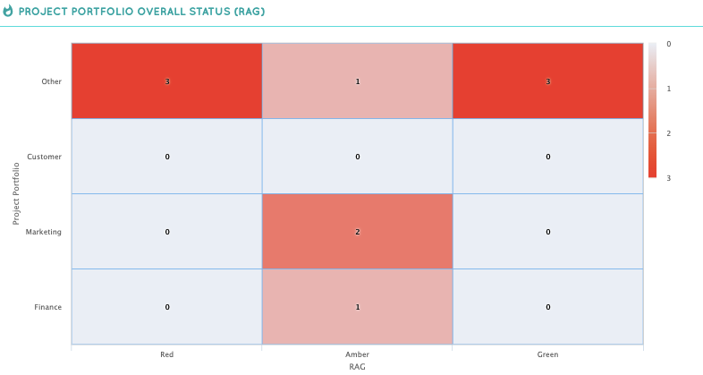
For example, here is a RAG status count (everything that is Red, Amber or Green), separated by project portfolio. This basically shows us at a glance which portfolios are struggling and others that are doing well. For help in setting up a RAG formula visit the bottom of the Formula attribute article.
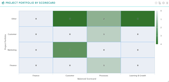
Below is another heat map that plots all projects based on what portfolio and balanced scorecard they fall under.
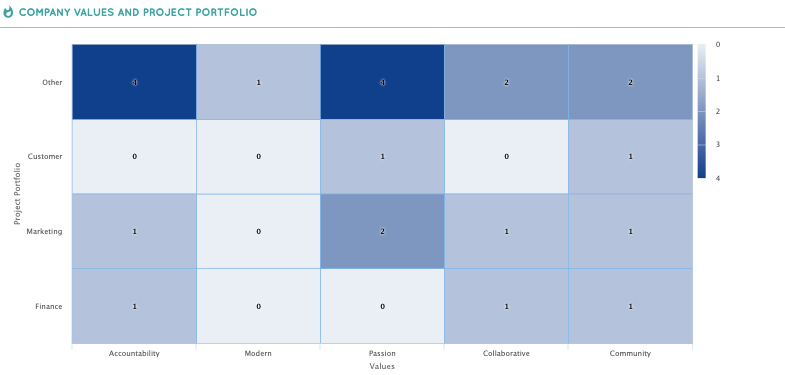
Below is a heat map that plots where (and how often) specific project portfolios relate to a certain company value.
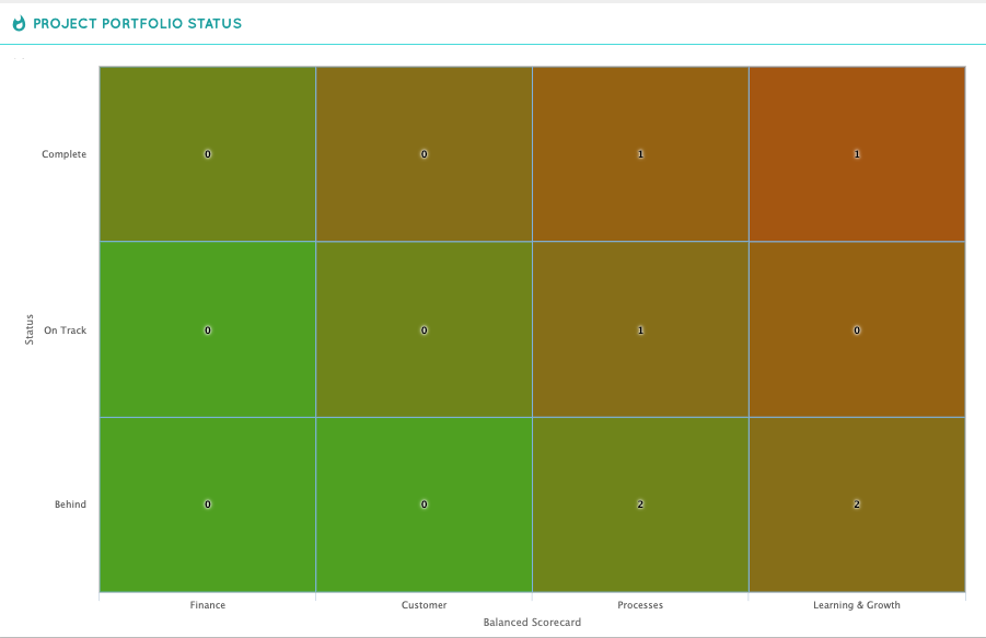
Lastly, you can set up formulas in Cascade to show status, project duration, RAG, Financial Status, and just progress in general. For example, here is an example of a heat map that plots the project portfolio attribute on the X axis, and a Status Formula on the Y Axis. For help in setting this up, please read the Formula Article.
For more advanced tracking, learn about how to create formulas within Cascade.