.png?width=200&height=80&name=Classic%20Experience%20(1).png)
Create beautiful dashboards that will enable you and your team gain powerful insights into your Cascade data and help you make informed decisions.
To add a Charts widget:
-
First go to Track > Dashboards.
-
Click "Add widget".
-
Choose the "Charts widget" and choose the chart type from the following options:
-
Bar single, stacked and grouped.
-
Pie (which we will cover in this article).
-
Line.
-
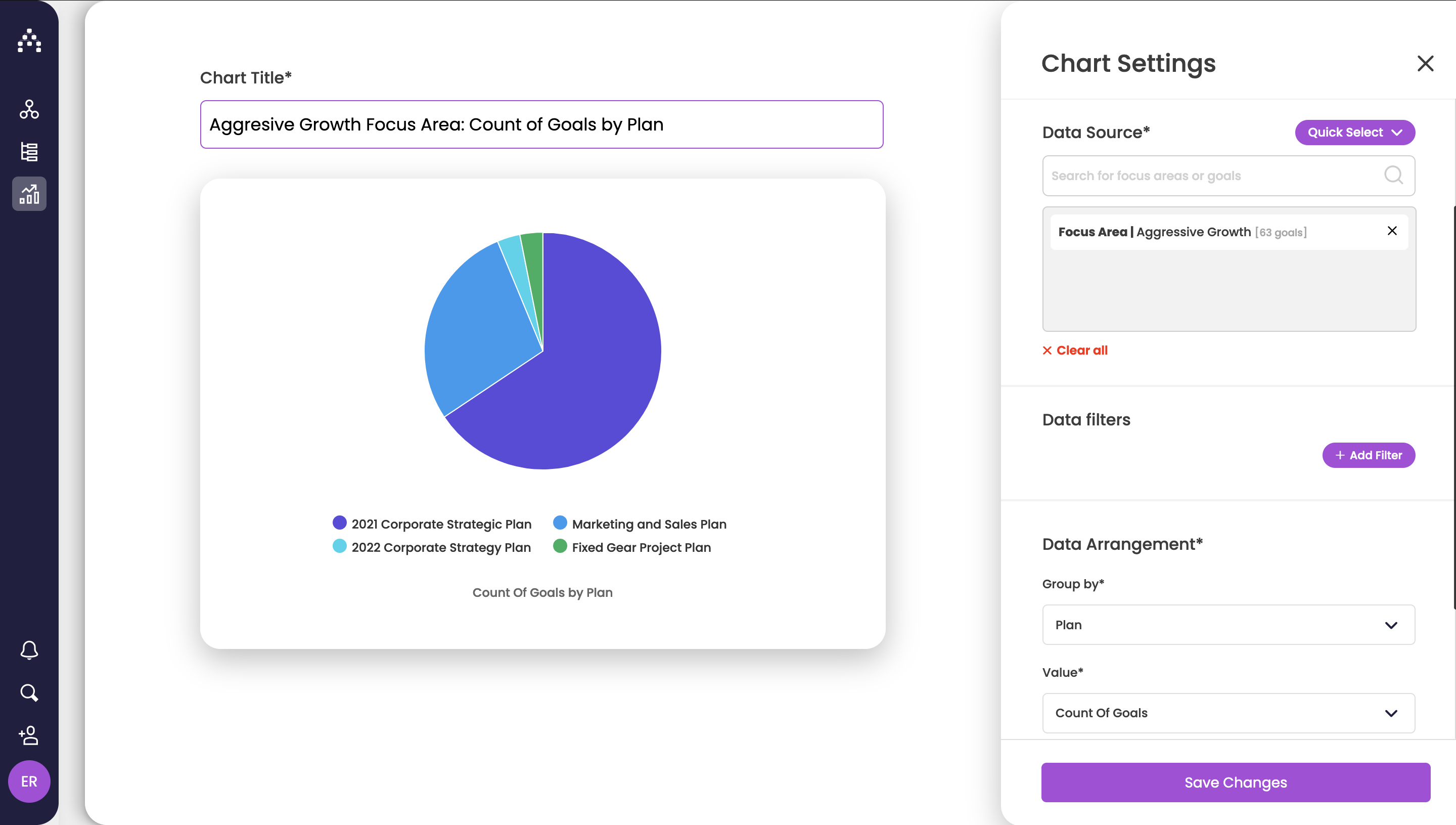
How to set up a pie chart
-
From Chart Type, select Pie chart and give your widget a name.
-
Next select Data Source. Here you can find specific goals or focus areas.
-
In Data Filters you can filter by any goal's attributes available. Learn more about Filters here.
-
Next select Group by and Value options from the Data Arrangement section.
-
You should see your chart update automatically on the left side.
-
-
You can choose whether to display a legend or data labels from the Display Settings section.
-
Click Save to see the pie chart on your dashboard.
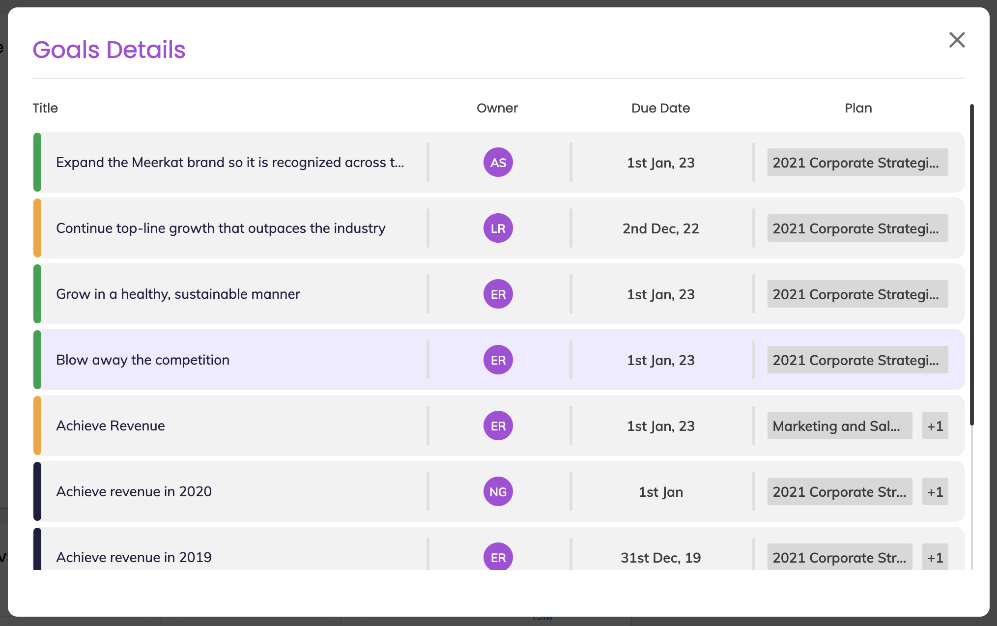
By clicking on one of the slices of the pie you'll see a breakdown of the data for each slice.