.png?width=200&height=80&name=Classic%20Experience%20(1).png)
Create beautiful dashboards that will enable you and your team gain powerful insights into your Cascade data and help you make informed decisions.
To add a Charts widget:
-
First go to Track > Dashboards.
-
Click "Add widget".
-
Choose the "Charts widget" and choose the chart type from the following options:
-
Bar chart.
-
Pie chart.
-
Line chart (which we will cover in this article).
-
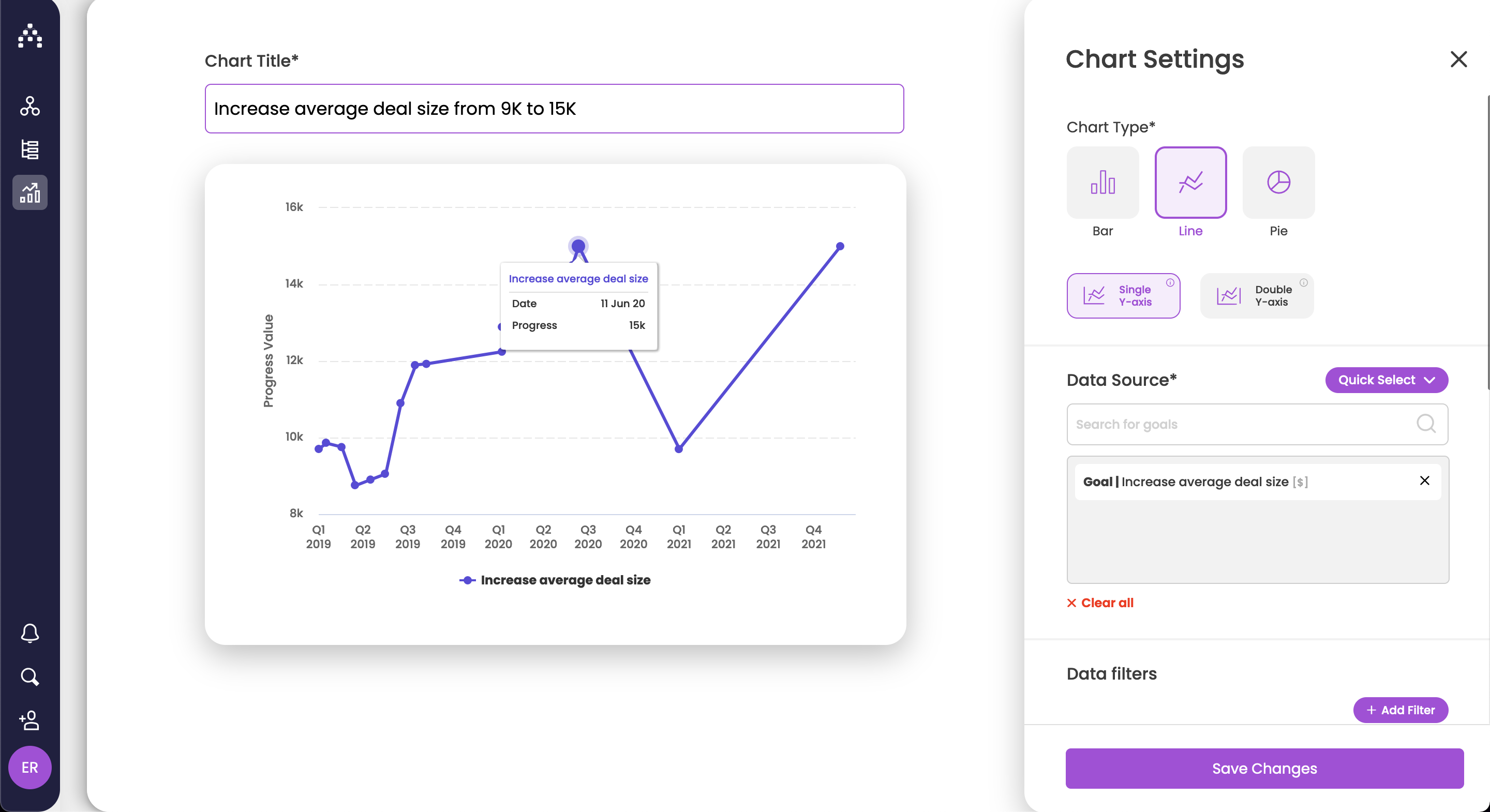
How to set up a line chart with a single y-axis
-
First of all, give your chart a meaningful name.
-
From Chart Type, select Line chart and then Single Y-axis.
-
Search for goals you'd like to analyze. You can select up to 20 goals.
-
Note: For Line chart only, goals need to be of the same unit (e.g. can only compare goals that have $ as a unit).
-
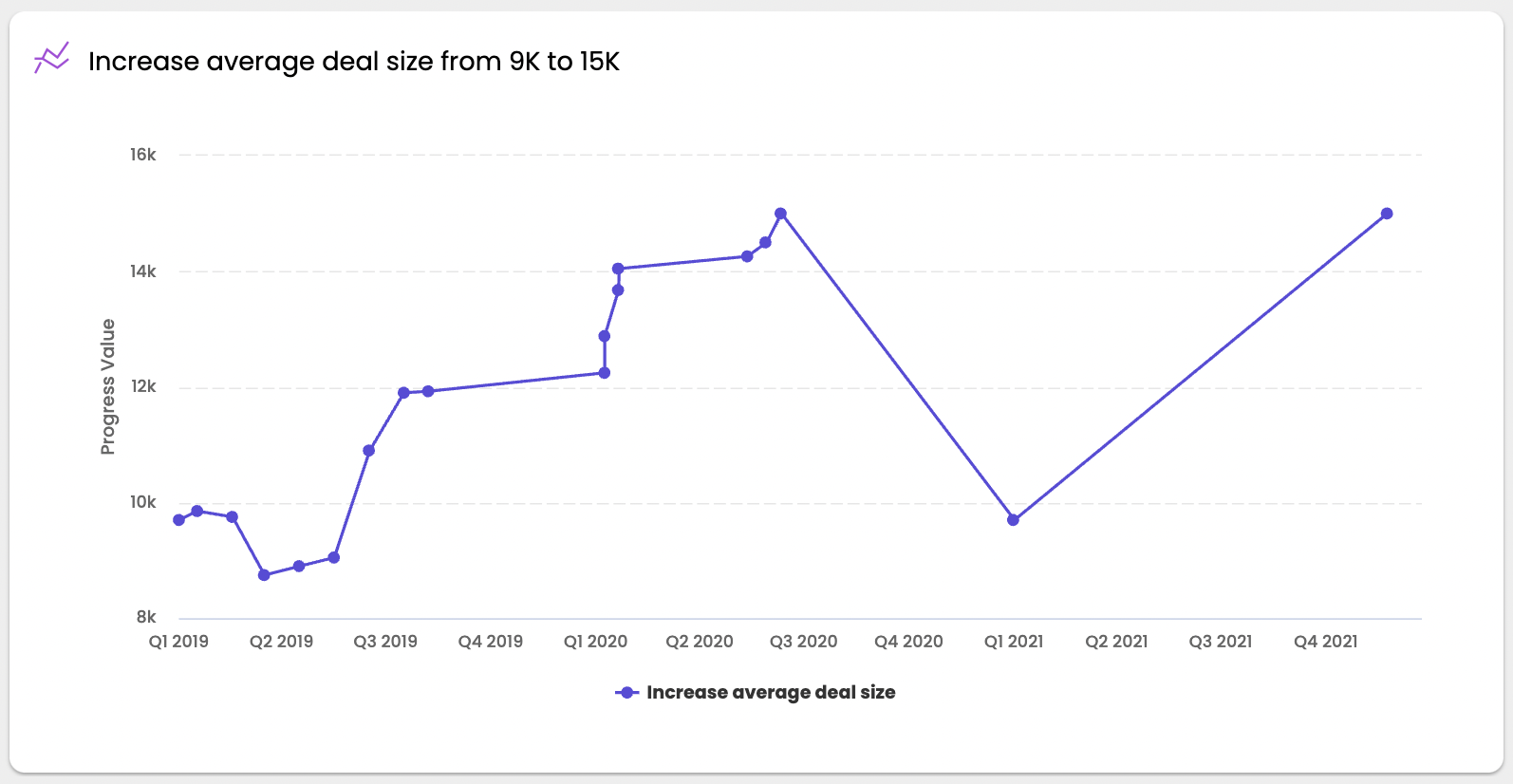
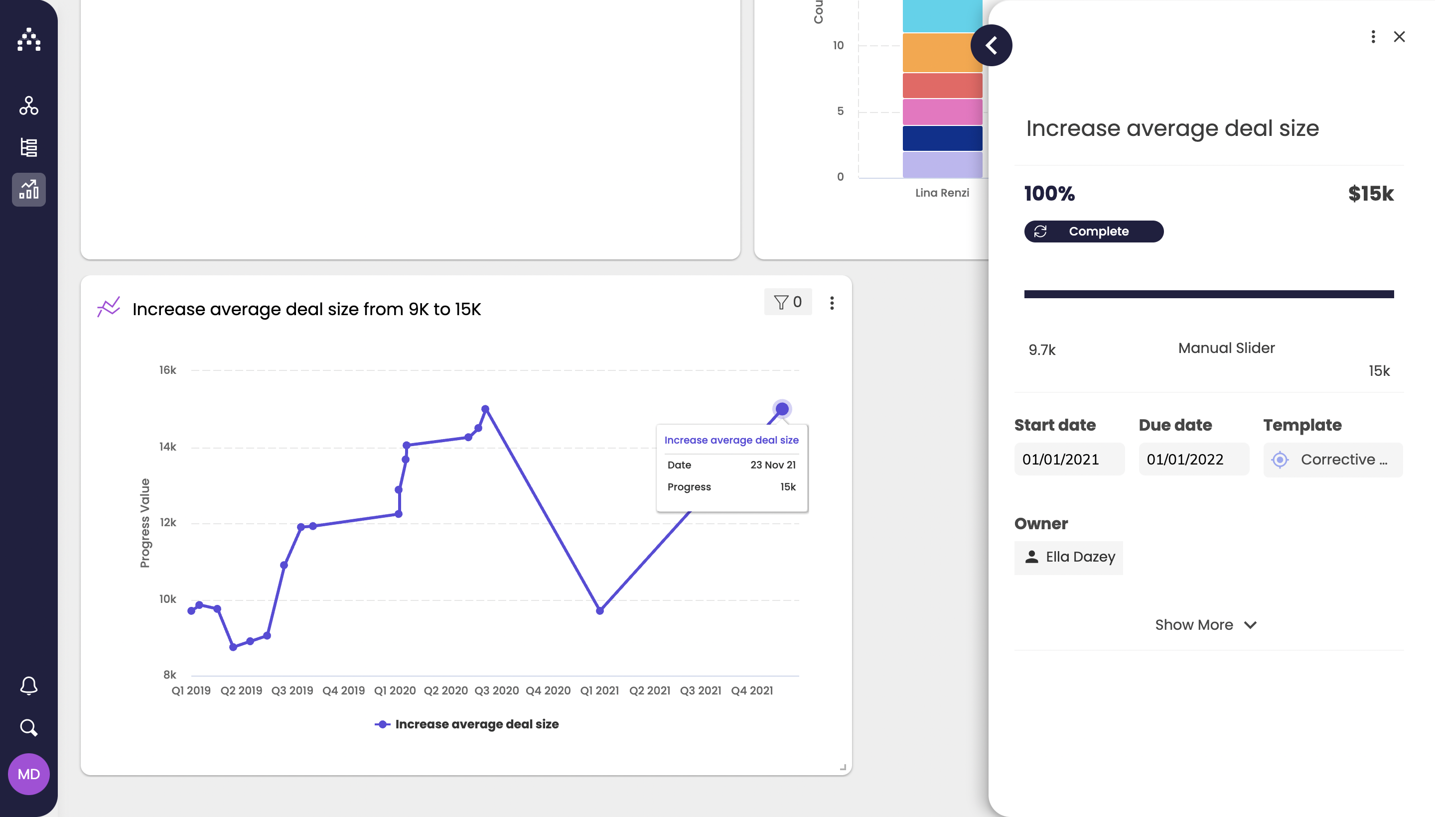
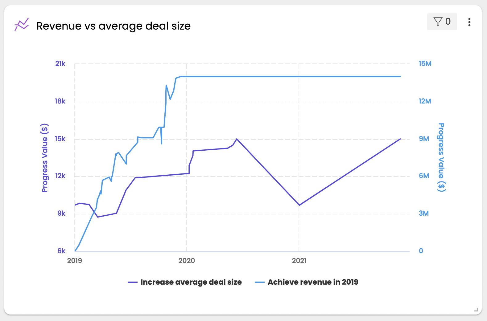
You should see your chart update automatically on the left side.
-
-
You can choose whether to display a legend, data points and labels from the Display Settings section.
-
Click Save to see the Line chart on your dashboard.
Click on the lines on the chart to open the goal sidebar.
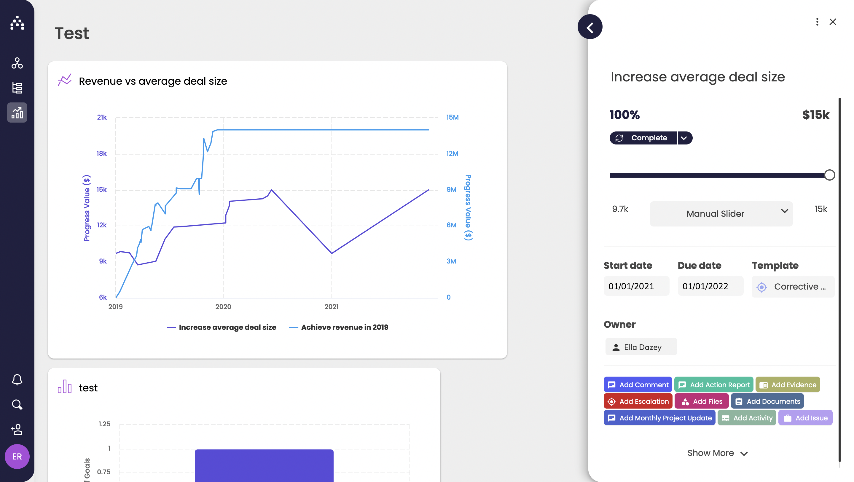
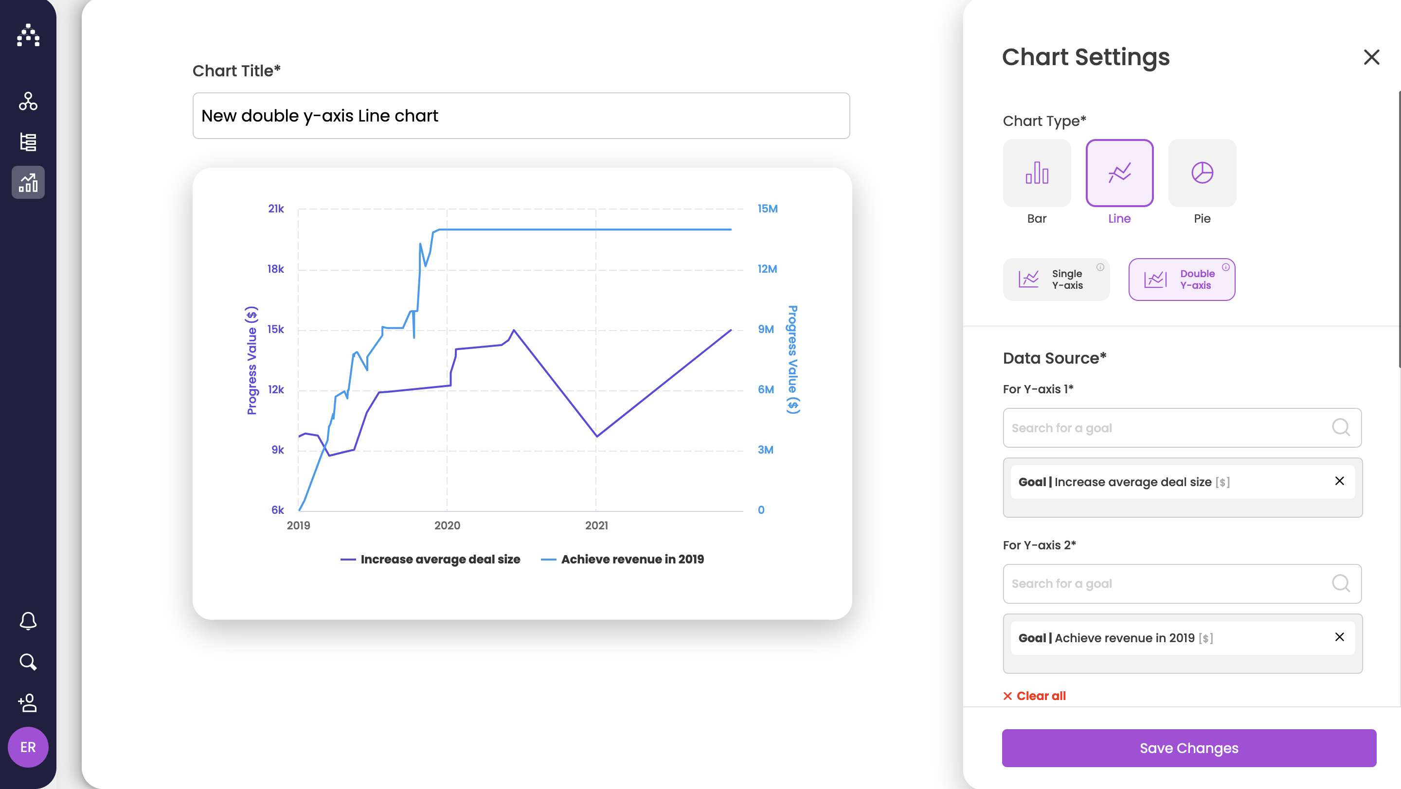
How to set up a line chart with double y-axis
-
First of all, give your chart a meaningful name.
-
From Chart Type, select Line chart and then Double Y-axis.
-
Search for goals you'd like to analyze. You can select up to 2 goals of the same or different units.
-
You should see your chart update automatically on the left side.
-
-
You can choose whether to display a legend, data points and labels from the Display Settings section.
-
Click Save to see the Line chart on your dashboard.
Click on the lines on the chart to open the goal sidebar.