The Cascade Map
As part of our "top-down, bottom-up" agile planning approach, we've introduced our Cascade Map to make visualizing alignment easier than ever for your teams. For the first time ever, you can now see a simple and instant view of how teams are aligned and progressing across your organization!
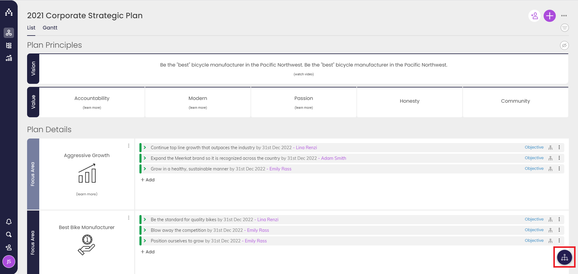
Click the Map icon in the lower-right corner on the Planner page to get started:
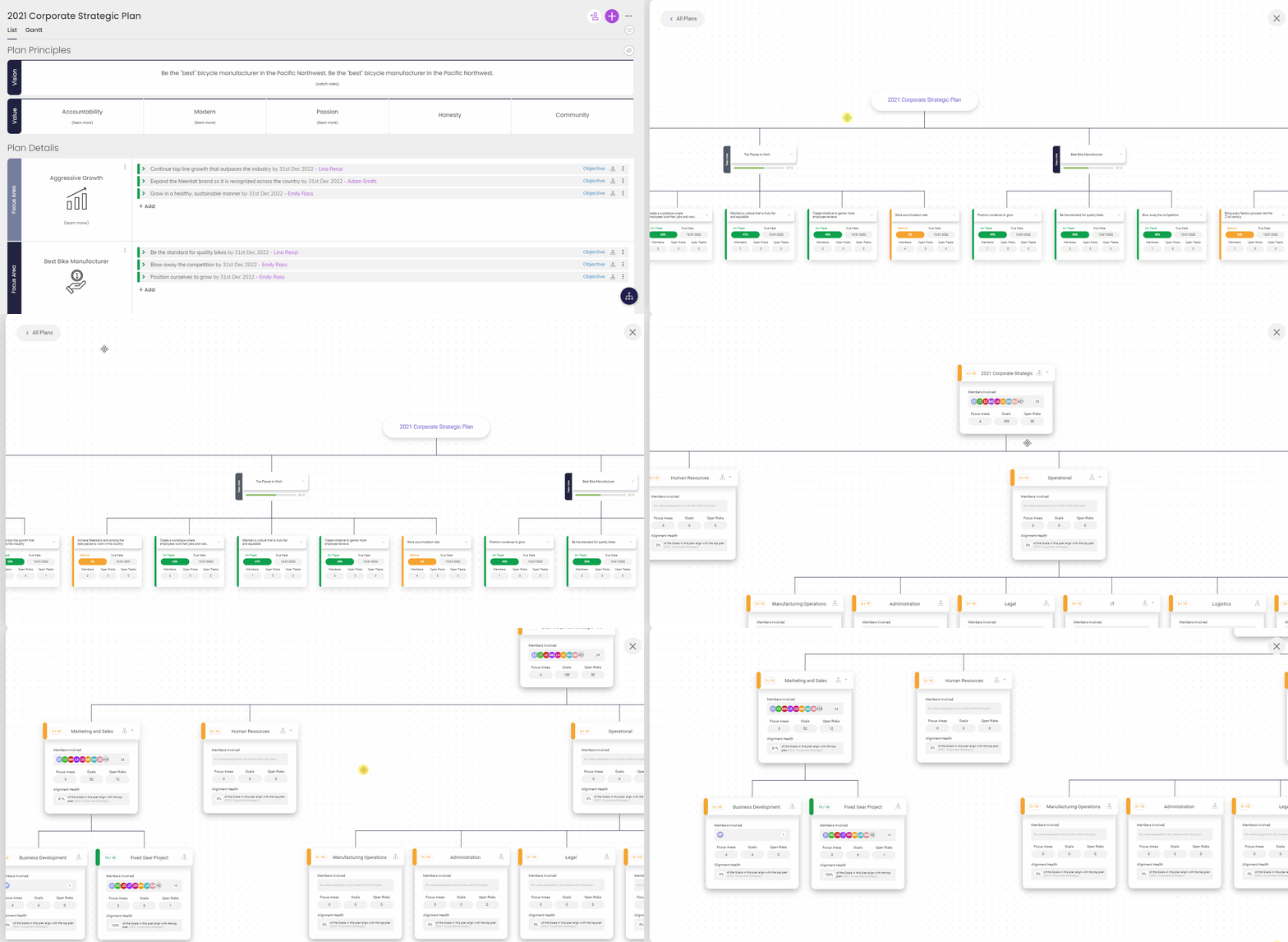
Drill down into the details of your current plan, or toggle over to "All Plans" to get a status view across all plans and see how your plan aligns to the bigger picture!
Highlights:
-
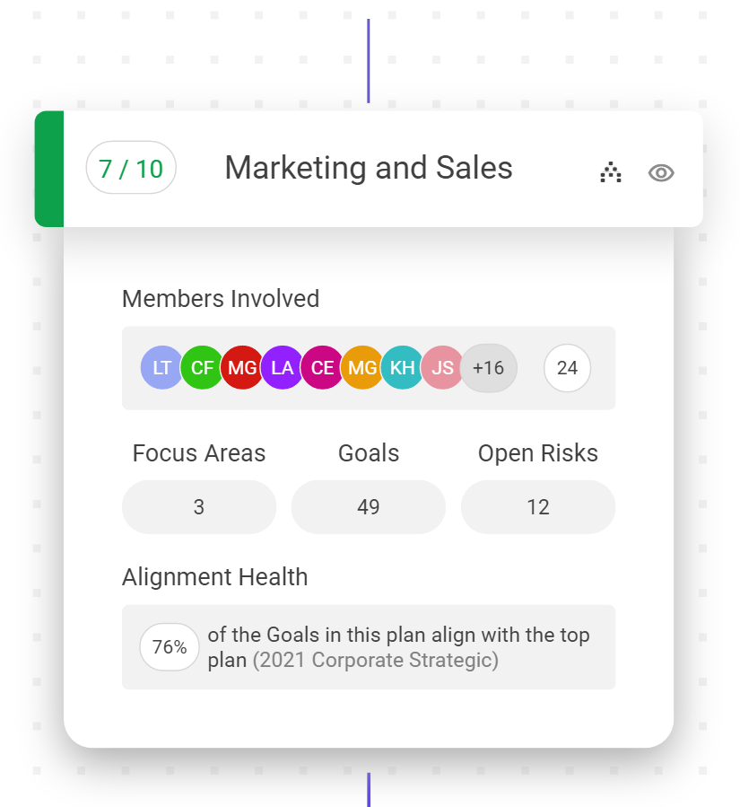
Gives a rating/colored status for each plan overall, even if each workspace has its own unique setup (yes, you can have unique frameworks for each page now!)
-
Lists initials of team members involved in each plan
-
Lists number of focus areas, goals, and open risks for each plan
-
Clearly shows degree of alignment: % of goals aligned to top-level plan
We're excited to give you and your teams a ton of insight and cleaner alignment with this powerful tool!
More to come with the Cascade Map, too...
.png?width=200&height=80&name=Classic%20Experience%20(1).png)


