Custom Field: Checkbox
The Checkbox field is the ideal field for when you have a short list of options for users to choose from!
Features
Colors
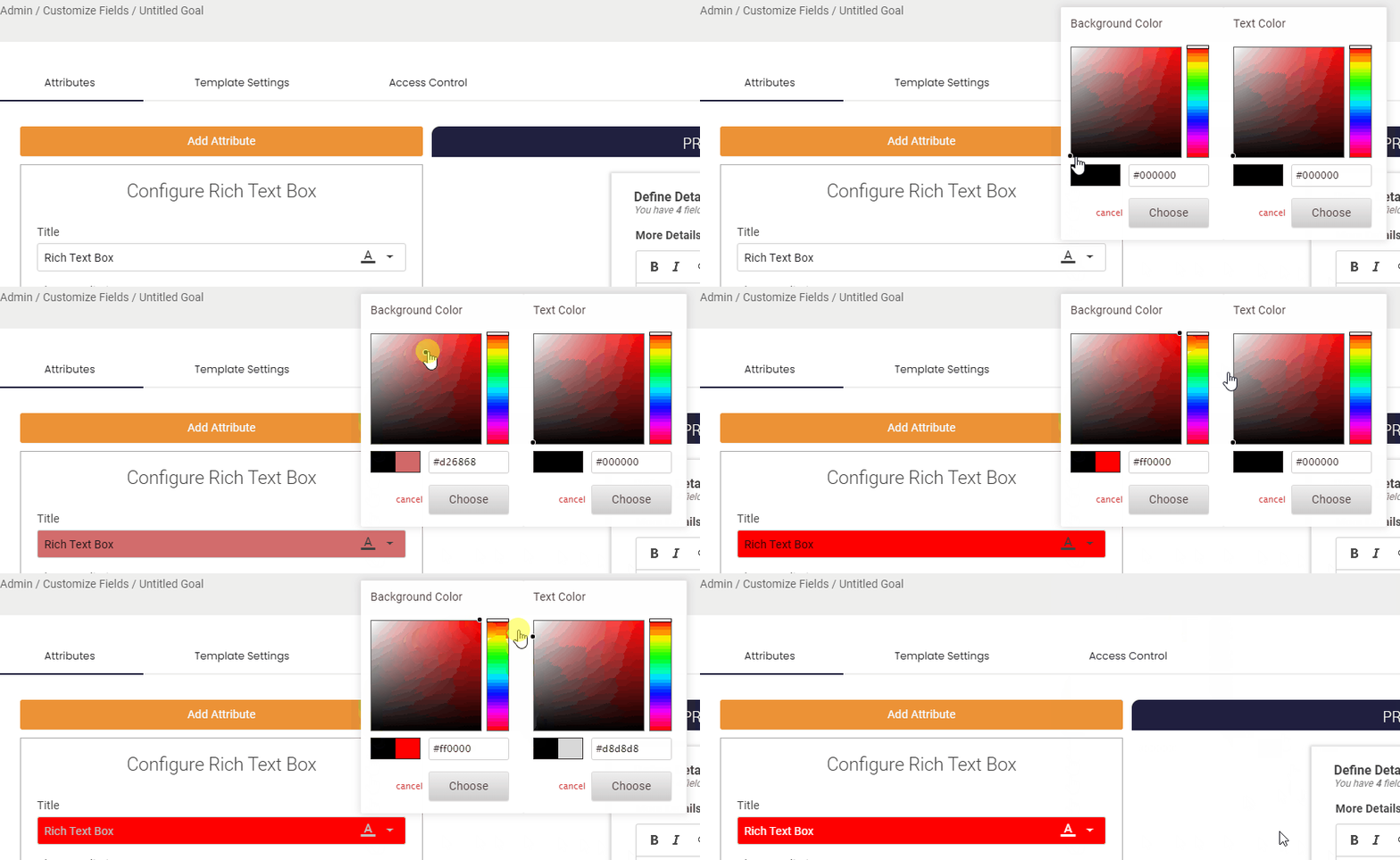
You can change the text and background colors on the field's title. This is can help draw users attention to it or distinguish it from other fields.
Description
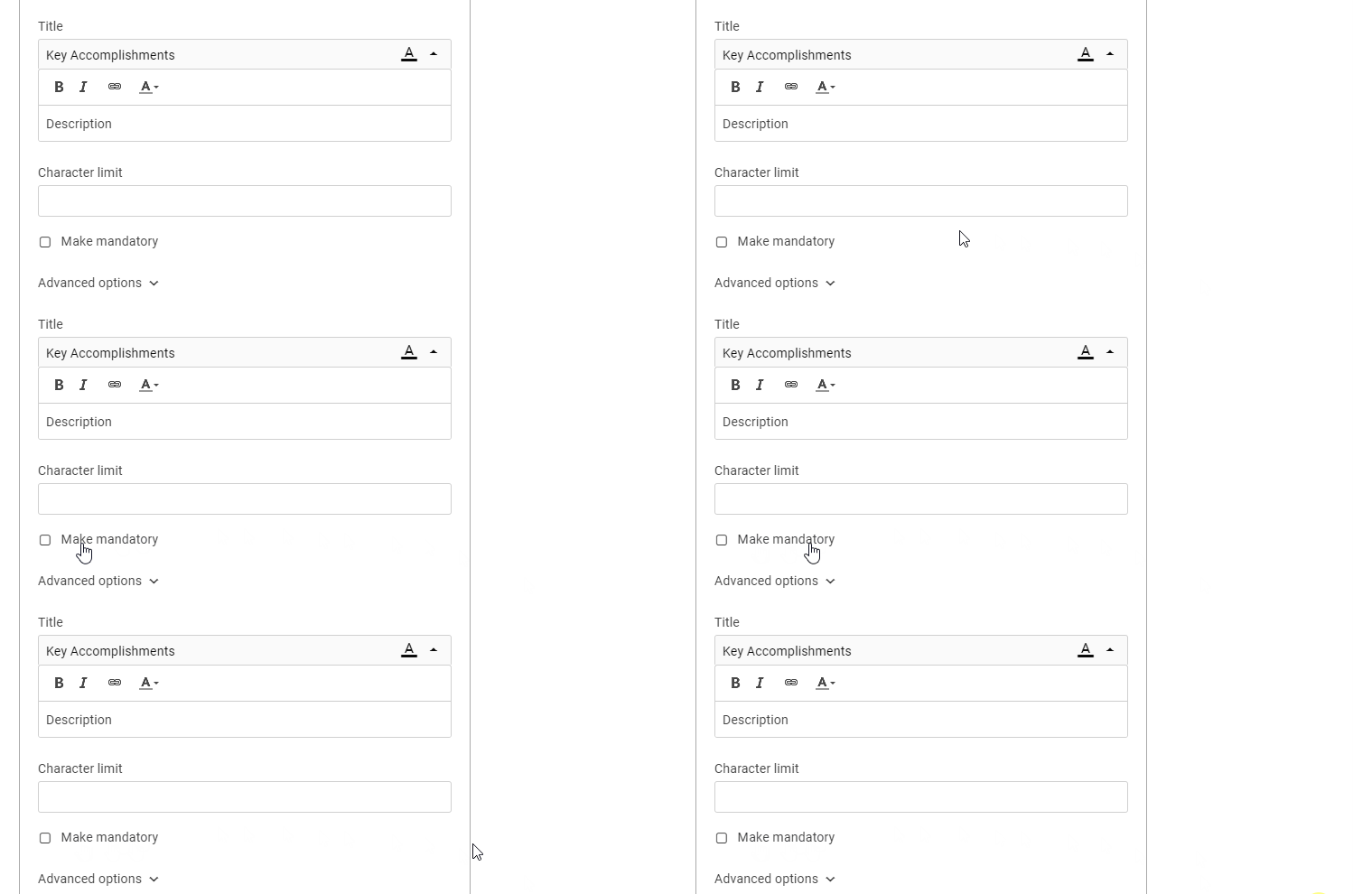
You can also an description of your field to help explain what it is and what information should be captured in it. If a description is added users will be able to view it by hover over the (i) Icon next to the field. You can also add description to the check box options.
Make Mandatory
By default when a new fields is created it will be mandatory for users to complete. However you can make any field an optional field if that piece of information is not always required.
Default Value
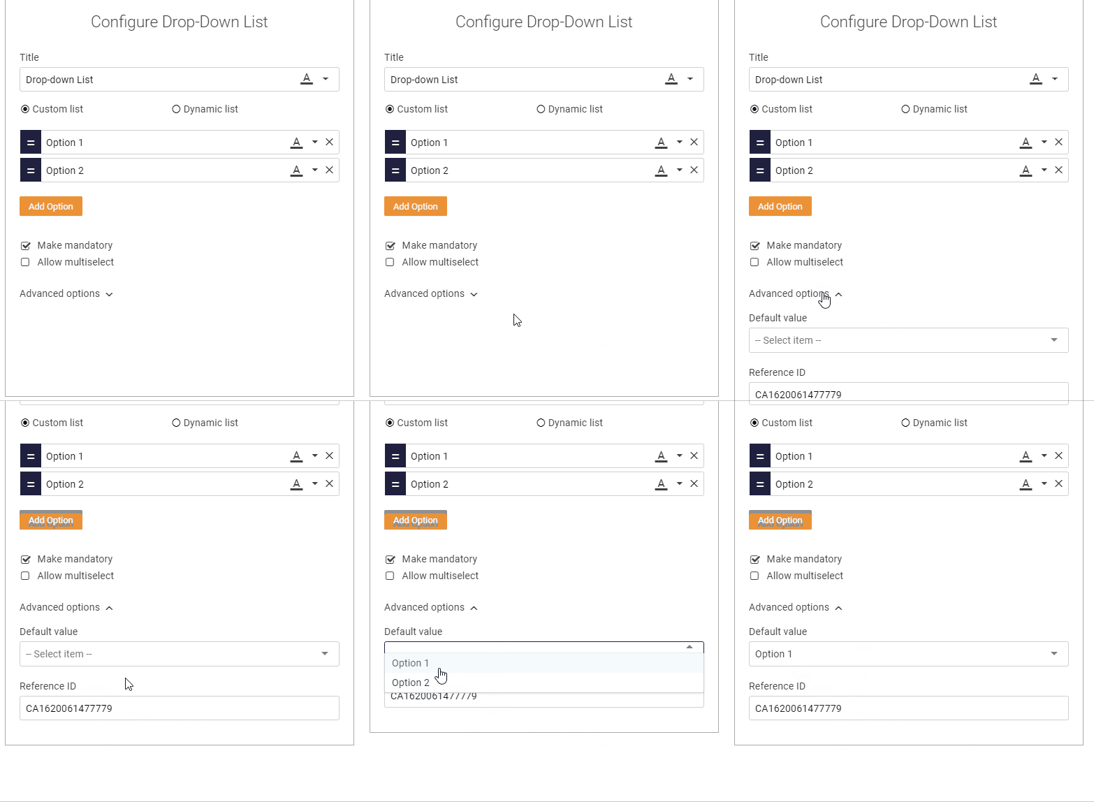
There is an option to select a default value for your check box, this could be the most common answer or the preferred selection.
Nesting Options
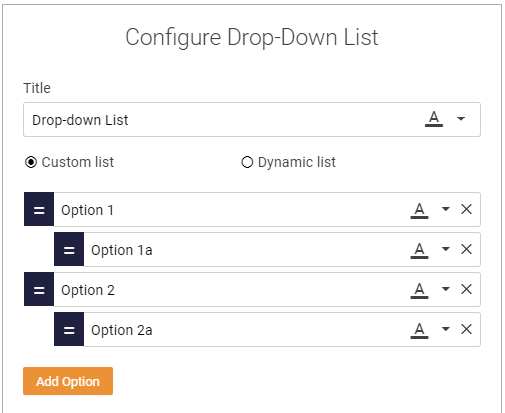
There is also the option to create a nested check box list. to do this simply drag an option to nest it. this allows you to create sub categories of options.
.png?width=200&height=80&name=Classic%20Experience%20(1).png)


